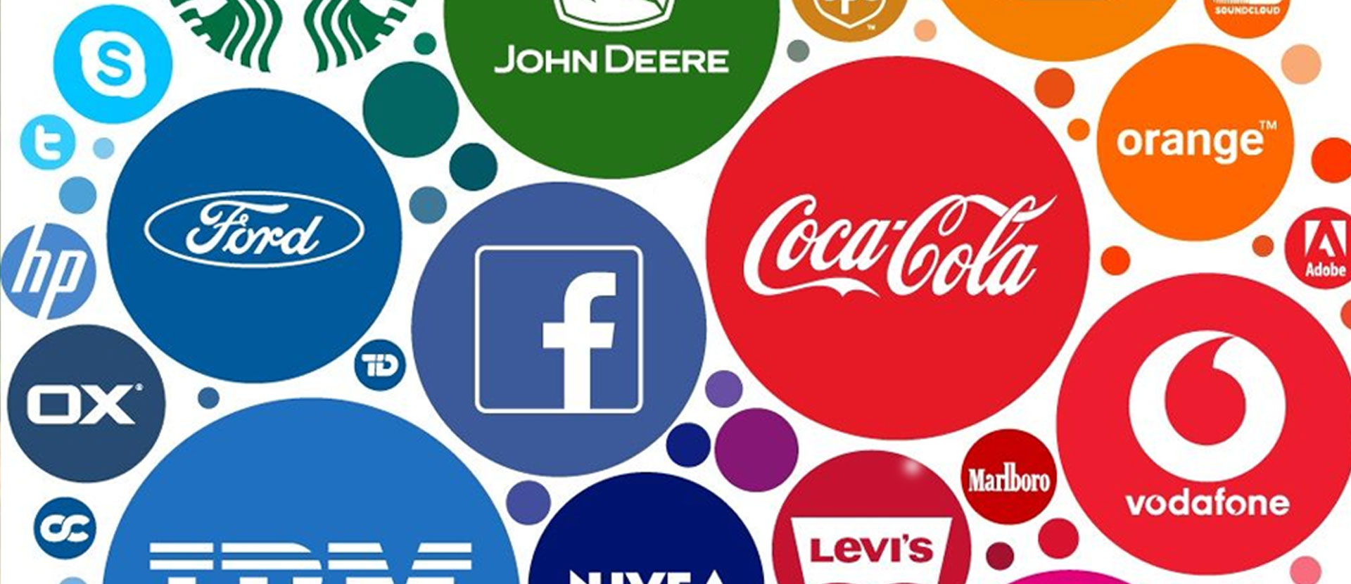
Visual identity is all the images and graphic information and assets that express the identity of the brand and distinguish it from others. In other words, it describes virtually everything customers can see, from the logo to the store interior to the product packaging and more. Everything you design indicates the identity of that brand, you will immediately know where the bottles of Coca-Cola are located in the beverage section of any store as soon as you see the color red in it, and in the mobile store you will recognize iPhones as soon as you see the shape of the apple, and so on.
What are the main visual identity elements?
It is true that the logo and colors are elements of the visual identity, but they do not represent the whole visual identity alone. When working on the design of the visual identity, you should plan to create integrated and consistent designs for various materials, from the website to the packaging. The visual identity elements should not be confused with the brand materials for which designs are required to be created, which differ in terms of diversity and style from one brand to another. The basic elements of visual identity include the following:
• Logo.
• Colors.
• Texts and typography.
• Imagery
• Illustrations.
• Icons.
• A guide to using the visual identity.
However, it is not enough to design these elements to be effective visual identity, but rather. Care must be taken that the elements of identity are distinct from the rest of the competitors and attract people’s attention, and it must be easily established in the minds. Apple, for example, did not write its name on its products, however, it is well established in people’s minds, and everyone knows its products and anything related to its brand as soon as they see an advertisement or a picture of it. The visual identity must be flexible and scalable as it must grow and evolve with the brand itself, and it must be coherent, consistent, and integrated so that the elements of the identity complement each other.
Before starting to design the visual identity element, the company, customer or brand must have a real commercial identity on which to build the visual identity elements. The business identity includes:
• Purpose of the brand.
• Vision.
• Mission.
• Message.
• Objectives.
• Value.
Through these data, you would understand the nature of the brand and its trends, and thus design the visual identity in proportion to it. This visual identity develops. It is important to preserve the heritage and foundation of the brand, as the vast majority of major brands in the world have developed their visual identity based on the old version, but with a new vision and innovative design methods in line with the development in marketing methods and people’s moods.
It does not necessarily seek to design a visual identity so as to force the target audience to accept what this brand offers. On the contrary, the needs and aspirations of the target audience and what they expect from this brand must be taken into account, thus achieving real closeness and attraction between the two parties, achieving goals, and delivering messages.
Visual identity elements design
After obtaining all the information that we talked about previously, writing ideas for the image and shape of the visual identity, and thinking carefully about the best way to go in the design, we will start working on designing the visual identity elements one by one, and the logo is always the first of these elements.
Logo
It is the first of these elements because it represents the shape and identity of the brand and most of what the audience sees and interacts with, and the logo design has regulating rules that help produce a coherent and balanced logo, starting from drawing plans and prototypes using pen and paper, then transferring the drawn ideas to design programs on the computer through the use of graphics Vector, starting from drawing the main points and lines, then developing the basic shapes of the logo, and finally coloring the logo in the appropriate colors for the nature of the visual identity and the brand, and it must be clear, simple and distinct.
Colors
Once you have designed an excellent logo that meets the needs of the brand and its audience, you can explore the color palette of the visual identity, and the color is one of the most important distinguishing features of the brand from its competitors and it is what evokes the emotions of the target audience and leads to the establishment of the brand in the minds.
A good color palette is organized and consistent and follows standard color schemes and provides designers with enough options to be creative but not enough to overpower it. This includes the main color and two auxiliary primary colors for the primary colors group, and as an additional option (secondary colors), three to five complementary colors can be added so as to give the designers a space of freedom for creativity and innovation within this color segment, as well, some brands have a group of tertiary colors, A tertiary color is the third level of a color palette that combines primary and secondary colors. A favorable reference point for the use of these colors is 10% of the entire color palette. Even though tertiary colors are not used often, they are still useful in adding diversity to the palette.
Texts
Each element of the visual identity must contribute to the formation of the brand’s personality and be integrated with each other. This certainly applies strongly to the text element and typography that you have to take inspiration from the logo you designed earlier. Two or three groups of fonts should be chosen at most for the visual identity to be used in other elements, so that we determine the groups of fonts that will be used for headings and others for paragraphs, and the groups used in advertising designs and brochures as well as used in the publication should be selected Advertising for social media.
Imagery
Designers usually neglect the element of photography because they are often looking for the easiest way to provide this element, which is through online photo storage sites, whether they are free or not. While the major brands in the world are interested in this element and employ photographers and specialists for it to take their own pictures, which will certainly distinguish them from others around the world. In the event that the brand offers realistic non-digital products, in this case, it must provide photographers who will photograph the products in a professional manner to be used by designers in designing advertising publications, prints, and web pages that will market these products in the best way.
That’s why the style element of the image or photography is important to create a brand image identity that sets it apart. When images fully express the brand and what the brand stands for, they have the power to evoke more emotion than any other design element, and a specific, consistent and unique image style will help. For the brand to create impressions and lasting relationships in favor of the brand.
For example, the Mercedes-Benz car company seeks to draw an impression that includes elegance and luxury on its products, even if it produces powerful cars, while the Dodge car brand seeks to create an impression of strength and merit more than elegance and luxury even if it produces luxury cars, and this is evident through the style of Photography by both brands.


Certainly, the rest of the visual identity elements of both brands stand out through the logo, fonts, colors, text positions, and visual weight, so that all elements of the visual identity are integrated within these two designs.
Illustrations, charts, and Infographic
Illustrations introduce narrative elements to visual content and allow for subtler emotions or more complex situations to be expressed. Including human figures make ideas active and accessible, often in a light-hearted or whimsical way. Illustrations turn away from realism and let you build the world as the brand sees it.
Illustration systems increase the range and depth of messages a company communicates visually about itself, from mission statements to practical product support, while strengthening brand image. And often it is increasing the awareness of the brand and helps the brand voice to be more shows off and distinguished, especially when the style of the illustration has a unique character, and has consistent with the rest elements of the brand’s elements.
Icons
Icons are what are used in websites, mobile applications, and even in advertising publications, where they are used to denote the services provided, the categories of products or services, or the features available in the brand, and these icons must follow the color schemes used in the visual identity and can be derived From the logo itself, and the design of icons, rules are similar to the design of logos.
Visual Identity Guidebook
The design of each element must follow the approach of visual identity design as a whole, but to implement this in a correct, professional and error-free manner, a visual identity guidebook must be produced, which includes detailed explanations of how to use the visual identity elements and how to apply the visual identity design style to any materials used before The brand, and thus the brand maintains a unified style for all its materials, products and advertisements, which is what major brands around the world do.
Be sure to include clear, easy-to-follow guidelines for each element of the brand’s visual identity, including examples and use cases, indicating as much information as needed to help designers successfully implement the brand’s visual identity. For example, it should be explained when we use the logo alone and where and when we use it with the text of the brand name, also when we use this format by placing text to the right of the logo, and when we use it in text placement format to the left of the logo and below and above the logo and other instructions.
In this link you can find an example of a brand guideline.
Integration in applying visual identity elements to brand materials
The brand materials used differ from one company to another, some companies apply visual identity elements to different materials, such as stationery and office materials such as envelopes and letterhead, designs on company cars, and uniforms for company employees, in addition to websites, mobile phone applications, and infographics. And even the designs and advertisements of social channels pages and the introduction of the company’s videos, as well as packages that include the company’s products and many other materials.
It is very important to apply the elements of visual identity such as colors, lines, shapes, and others on all materials used by the brand to achieve integration among them and to strengthen and consolidate this brand in people’s minds, which contributes to the spread and success of this brand.
Conclusion
Visual identity design means designing the basic outlines that will be used to design various materials that will appear in public in front of the public, which highlights this brand and distinguishes it from its competitors, and establishes its appearance and the appearance of its products in people’s minds, which in turn helps to achieve spread and marketing. All of this is considered one of the most important requirements of this era to achieve success for brands.
On my website, you can check the project CleverShutttle as a good example related to this topic.
Thank you for your reading. Join the conversation by posting a comment.